I recently upgraded the operating system on my iPhone. Not that that would normally be a big deal—I generally try to keep such things current, despite the occasional “bumps” that inevitably come with software upgrades. But this time the upgrade wasn’t just about improving performance and fixing issues that had been identified since the last update. No, this one not only LOOKED different, some core functions were said to work differently—and “different” in this case appeared to be a problem for a number of users.
So, before I took the “plunge,” I spent some time trying to do some research—trying to find out what kinds of improvements I could anticipate, and to better understand the complaints associated with an upgrade from which there was, apparently, no “return.” The upgrades were readily quantified (on the vendor’s website most notably), although I think it’s fair to say they had a motivation in promoting the new system. However, most seemed to be relatively unimportant in terms of how I used, or planned to use, my device. As for the problems: Well, they were equally easy to find, but harder to quantify. And, like those product ratings on any website, were from people I did not know and whose judgments I had no particular reason to trust.
Consequently, stuck between conflicting perspectives, and seeing no particular advantage in making a change, I did what most human beings do. Nothing. Until, with my current contract expiring, I realized that the upgrade was likely to be imposed on me at that point, regardless of my preferences.
On October 1, the public marketplaces (formerly known as connectors or exchanges) associated with the implementation of the Patient Protection and Affordable Care Act (PPACA) will begin to come online—in various phases and, from what one can discern from published reports and official updates, in various states of readiness. The advantages have been outlined, as have the potential pitfalls. Doubtless the experiences will be as varied as the experience(s) and expectation(s) of the individuals involved.
However, it’s hardly a new idea. Back in 1980 the conservative Heritage Foundation began advocating that the Federal Employee Health Benefit Program (FEHBP—a marketplace for multiple insurers and scores of plan options) become a model for expansion of health coverage through an individual mandate. Today, simply telling those in Washington, DC, that “the marketplaces are just a version of FEHBP” brings an immediate understanding of the concept.
A year ago, EBRI published an Issue Brief that outlined the issues related to private health insurance exchanges, possible structures of an exchange, funding, as well as the pros, cons, and uncertainties to employers of adopting them. That report contained a summary of recent surveys on employer attitudes, as well as some changes that employers have made to other benefits that might serve as historical precedents for a move to some type of defined contribution health benefits approach. It is a report that provides both current analysis alongside a historical perspective—a resource for those looking to better understand and plan for the potential changes ahead.¹
That said, when Paul Fronstin, EBRI’s director of Health Research and the EBRI Center for Research on Health Benefits Innovation, updates the information in the future, he may well call them marketplaces, unless the name “upgrades” again in the weeks ahead!
Nevin E. Adams, JD
¹ See “Private Health Insurance Exchanges and Defined Contribution Health Plans: Is It Déjà Vu All Over Again?” online here.
You can find a catalogue of recent EBRI research on PPACA and its potential impact on employment-based health benefits online here.
this blog is about topics of interest to plan advisers (or advisors) and the employer-sponsored benefit plans they support. *It doesn't have a thing to do (any more) with PLANADVISER magazine.
Sunday, September 29, 2013
Sunday, September 22, 2013
Future Tense?
Americans have long had a beef of sorts with the U.S. health care system.
Asked to rate that system, a majority of workers describe it as poor (21 percent) or fair (34 percent), and while nearly a third consider it good, and less than half that many rate it as very good (12 percent) or excellent (2 percent), according to the 2013 Health and Voluntary Workplace Benefits Survey (WBS). Perhaps more significantly, the percentage of workers rating the health care system as poor doubled between 1998 and 2006, according to the 1998–2012 Health Confidence Survey (HCS).
On the other hand, workers’ ratings of their own health plans continue to be generally favorable. In fact, one-half (51 percent) of those with health insurance coverage are not just content with the coverage they have, they are extremely or very satisfied with it.
Satisfaction with health care quality continues to remain fairly high, with 50 percent of workers saying they are extremely or very satisfied with the quality of the medical care they have received in the past two years.
In fact, dissatisfaction with the health care system appears to be focused primarily on cost: Just 13 percent are extremely or very satisfied with the cost of their health insurance plans, and only 11 percent are satisfied with the costs of health care services not covered by insurance.
And, despite the ongoing (and frequently dramatic) news coverage of changes (current and contemplated) resulting from the Patient Protection and Affordable Care Act (PPACA), workers continue to be generally confident that their employers or unions will continue to offer health insurance. In 2013, 28 percent of workers report that they are extremely confident their employers or unions will continue to offer coverage, 37 percent are very confident, and 28 percent are somewhat confident.
On the other hand, confidence about the health care system decreases as workers look to the future. While 46 percent of workers indicate they are extremely or very confident about their ability to get the treatments they need today, just 28 percent are confident about their ability to get needed treatments during the next 10 years; and while 39 percent are confident they have enough choices about who provides their medical care today, fewer than- 1 in 4 are confident about this aspect of the health care system over the next 10 years.
Finally, 25 percent of workers say they are confident they are able to afford health care without financial hardship today, but this percentage decreases to 18 percent when they look out over the next decade.
Ultimately, the findings of the 2013 Health and Voluntary Workplace Benefits Survey provide not only valuable insights into how Americans view and value their health care now, but also a sense that the current comfort and confidence levels could be relatively short-lived.
- Nevin E. Adams, JD
“The 2013 Health and Voluntary Workplace Benefits Survey: Nearly 90% of Workers Satisfied With Their Own Health Plan, But 55% Give Low Ratings to Health Care System” is available online here.
Sunday, September 15, 2013
Thinking "Caps"
In this era of “reality” TV, where the “antics” (and worse) of the formerly rich and infamous are on display in ways that could not even have been imagined a decade ago, I seem to find myself increasingly shaking my head and muttering “what were they thinking?” The answer, as often as not, seems to be “they weren’t.”
And some, looking at the retirement savings behaviors and expectations of the American workforce over the years, might well wonder—and perhaps respond—the same way.
Whether you are an employer trying to motivate workers to avail themselves of a new benefit (or to better utilize an existing one), an advisor looking to improve their portfolio diversification, a provider interested in expanding acceptance of your product set, or a regulator trying to fine-tune (or overhaul) the current legal boundaries, sooner or later you find yourself wanting (perhaps NEEDING) to know “what are ‘they’ thinking?”
In just a few weeks, we’ll begin development of the 24th Retirement Confidence Survey, the longest-running annual retirement survey of its kind in the nation. As you might expect, the survey contains a core set of questions that is asked annually, allowing key attitudes and self-reported behavior patterns to be tracked over time. We ask both workers and retirees about their confidence in their retirement income prospects, including Social Security and Medicare; how much money have they saved for their future and where they are putting their money; who they turn to for retirement investment information and advice; and seek insights on why they are not saving more and what would motivate them to do so. The survey also allows us to gain the perspective on those issues from those already in retirement, providing an invaluable reality “check” between active workers and current retirees on expectations such as retirement age, spending, and retirement financial needs.
We’ve also asked forward-looking questions, tried to gauge worker interest in using technology, social media, and various investment products to manage their retirement accounts, and gotten valuable insights on how specific regulatory and legislative changes might affect their future savings behavior—insights that we’ve been able to incorporate with our extensive databases and modeling capabilities to quantify the potential impact on overall retirement savings and security.
In a very real sense, the Retirement Confidence Survey provides a unique window through which we can both examine long-term trends and sentiments, and still glean a sense of the future—an appreciation both for what has been, and for what might yet be.
It’s a chance to find out not only “what are they thinking?” but uncover the actions that could influence, if not drive better behaviors in the future.
- Nevin E. Adams, JD
If your organization would like to participate in the design of the 2014 Retirement Confidence as an underwriter, please contact me at nadams@ebri.org Underwriters not only provide input on the survey questions, but have access to the raw data, are briefed on its findings prior to publication; have the ability to utilize the survey materials and findings for research, marketing, communications, and product-development purposes; and are acknowledged as underwriters in the final survey report.
More information about the Retirement Confidence Survey, as well as links to previous iterations of the RCS, are available at http://www.ebri.org/surveys/rcs/
Sunday, September 08, 2013
"Some" Totals
There’s an old tale about a group of men that are blindfolded and then asked to describe an object (in the story, an elephant, though they don’t know what it is), based on their individual observations. In doing so, each one grasps a different part, but only one part, such as the side, the trunk, the tail, the ear, or a tusk.
Following their individual assessments of what is ostensibly the same object, they compare notes―and are puzzled to find their conclusions about the object’s appearance to be in complete disagreement.
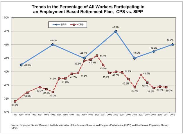
A recent EBRI Notes article¹ examined retirement plan participation through the prism of data from the Survey of Income and Program Participation (SIPP), which is conducted by the U.S. Census Bureau to examine Americans’ participation in various government and private-sector programs that relate to their income and well-being.
Now, as the EBRI analysis notes, the SIPP data have the advantage of providing relatively detailed information on workers’ retirement plans, but SIPP is fielded only once every three to five years. By comparison, the Current Population Survey (CPS), which is also conducted by the U.S. Census Bureau, provides overall participation levels of workers on an annual basis, but the CPS does not provide information on the specific types of plans in which the workers are participating. Another data source is the Bureau of Labor Statistics’ (BLS) National Compensation Survey, which annually surveys establishments’ offerings of employee benefit programs, including retirement plans―but at an employee level it includes information only on occupation, union status, and part-time/full-time work, and no information on age, gender, or race/ethnicity. Consider also that the CPS collects information about anyone who worked at any point in a previous year, while SIPP and BLS ask only about current workers in the month of interest.
As you can see, each of these national (and widely cited) surveys collects data in a different manner, at different times, and has different questions that can lead to different conclusions. Consider the chart below. The top line shows retirement plan participation rates for all workers from SIPP, and the lower line graphs retirement plan participation, also for all workers, from the CPS. While the trend lines generally move in the same direction, the more frequent CPS data allows us to see the more incremental movements―and to see a drop in participation rates in 2000–2002 following the burst of the tech bubble that would be completely missed looking only at the SIPP results. Moreover, relying strictly on SIPP data, one might well be inclined to see an increase in participation rates, rather than the leveling off that we see based on CPS data.²
That said, each survey provides important data that can’t be found elsewhere: CPS has the annual participation data with a complete set of worker demographics, while SIPP has the complete set of worker demographics plus retirement plan types, and BLS has detailed data on establishment characteristics, along with retirement plan type, although with limited worker demographics.
There was nothing inherently wrong in the individual observations made by the three blind men in the story―other than their examinations focused on one particular attribute, rather than appreciating the reality that a truly accurate assessment required looking at ALL the pieces, rather than each in isolation.
Similarly, and as the EBRI analysis concludes, those who would draw conclusions from individual surveys or datasets are well-advised to benchmark those results against other data, lest they conclude that the elephant(s) in the room are different than they truly are.
Nevin E. Adams, JD
¹ See “Retirement Plan Participation: Survey of Income and Program Participation (SIPP) Data, 2012,” online here.
² Another potential limitation of these surveys is that they are based on self-reported information, which is to say they rely on respondents’ recollections, rather than actual administrative plan data or IRS tax records. For SIPP specific results, see, for example, Irena Dushi, Howard M. Iams, and Jules Lichtenstein, “Assessment of Retirement Plan Coverage by Firm Size, Using W-2 Tax Records,” Social Security Bulletin, Vol. 71, No. 2, 2011, pp. 53–65, online here.
Sunday, September 01, 2013
How Much Would You Pay?
Growing up, I remember late night television being broken up by commercials touting a series of interesting products, everything from a rod-and-reel contraption that would fit in your pocket to a special set of knives that would, apparently, slice through any substance in the known universe without ever being sharpened. But unlike the commercials that ran during prime time, having made the pitch, the announcer lead viewers through a series of additional product extensions, generally with the admonition, “but wait, there’s more…”
Even with all that buildup, as the commercial closed viewers were reminded of the features of the product, and then asked, “Now, how much would you pay?” as several possible prices were suggested, then crossed off before being informed of the actual price (“plus shipping and handling”). And then, to close the deal, viewers were frequently told that they could have a SECOND version of the product for the same price (“just pay shipping and handling”).
I’m happy to say that I considered buying more of those offerings than I actually bought (albeit somewhat embarrassed to admit to how many I HAVE purchased over the years). The lessons I learned early on were that the product never worked nearly as well at home as it did on television, that you almost never had a good use for the second “at no additional charge” copy, and that when you added up ALL the costs, you frequently found out a sizeable gap between what you thought you were paying, and the actual bill.
Earlier this year, as part of its 2014 budget proposal, the Obama administration included a cap on tax-deferred retirement savings that would limit the amounts that could be accumulated in specified retirement accounts―which covers most of the ERISA-qualified plan universe (401(a), 401(k), 403(b), certain 457(b), as well as individual retirement accounts (IRAs), and―to the surprise of many―defined benefit pension plan accruals, as well.
The proposal would limit the amount(s) accumulated in these accounts to that necessary to provide the maximum annuity permitted for a tax-qualified defined benefit plan under current law, currently an annual benefit of $205,000 payable in the form of a joint and 100 percent survivor benefit commencing at age 62. This, in turn, translates into a maximum permitted accumulation for an individual age 62 of approximately $3.4 million (a number that many of the initial media reports carried) at the interest rates prevailing when the proposal was released. And, certainly initially, most of the analysis of the proposal’s impact―including that from EBRI’s own unique and extensive databases―was focused on how many individuals had accumulated account balances in excess of that $3.4 million today.
But, taking a longer view, and using our proprietary Retirement Security Projection Model,® EBRI’s simulation results for 401(k) participants (assuming no defined benefit accruals and no job turnover) show that more than 1 in 10 current 401(k) participants are likely to hit the proposed cap sometime prior to age 65―even at today’s historically low discount rates. If you assume discount rates closer to historical averages, the percentage likely to be affected increases substantially.
As part of the analysis published in the August 2013 Issue Brief,¹ EBRI Research Director Jack VanDerhei also looked at the potential impact of the proposed cap based on two stylized, final-average defined benefit plans and a stylized cash balance plan, along with a number of different discount rate assumptions. As an example, assuming coverage by a defined benefit plan providing 2 percent, three-year, final-average pay benefits, with a subsidized early retirement at 62, and assuming an 8 percent discount rate, nearly a third are projected to be affected by the proposed limit.
VanDerhei also looked at the potential response of plan sponsors, specifically smaller 401(k) plans (those with less than 100 participants), whose owners might reconsider the relative advantages of continuing the plans, particularly in situations where that owner of the firm believes that the relative cost/value of offering the plan is significantly altered such that the benefit to the owner is reduced. Since these owners (and their personal circumstances) can’t be gleaned directly from the data, some assumptions had to be made. But, depending on plan size, the EBRI analysis indicates this could involve as few as 18 percent of the small firms (at a 4 percent discount rate) or as many as 75 percent of the small firms (at an 8 percent discount rate).
The administration’s budget proposal estimated that the retirement savings cap would generate an additional $9 billion in revenue. But the question―and one that the EBRI analysis helps policy makers answer, and for a wide range of possible outcomes―is “how much would it cost?”
Nevin E. Adams, JD
¹ See “The Impact of a Retirement Savings Account Cap,” online here.
Labels:
401(k),
401k,
403(b),
403b,
retirement,
retirement plan,
retirement savings,
tax incentives,
tax policy
Subscribe to:
Posts (Atom)